Thursday, April 30, 2015

Mean Absolute Deviation

This post will cover the topic of Mean Absolute Deviation, also known as MAD.  MAD tells if all data points are evenly distributed.  A small MAD average means the data clusters close to the mean of the values.  A large MAD average means the data is more spread out from the mean of the values.


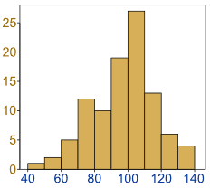
Notice that the Mean, Median, and Range are the same number for all the Histograms.

The way this is calculated is by finding the mean of a set of data.  Then to find the median, followed by the range.  With this information, the next step is to set up a table similar to the one.  Make sure it contains these titles for the columns: X values, the mean of the set, the X value - the mean of the set, and the absolute value of the X value - the mean of the set.  Then have the total average at the bottom.
                                                       
 (Here is a fun activity for your students to play that goes off of what I have explained about statistics using Mean Absolute Deviation.) Activities to practice MAD.

Blogroll:

Tags:

Wednesday, April 29, 2015

Central Tendency

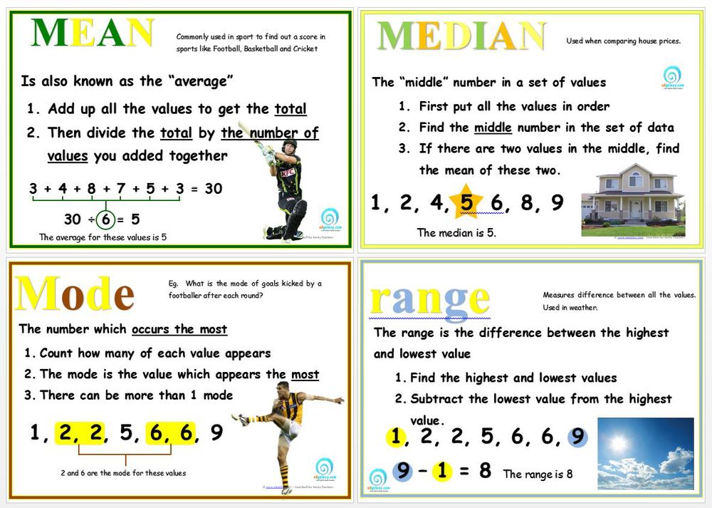
This post covers central tendency this is just a fancy way of saying mean, median, and mode.  These are different forms of finding frequencies in a list of data.  Mean is the average of the data.  This is calculated by adding all the data together and then dividing it by the number of data points you have.  Median is the middle number of all the data points.  if the list of data is even you just find the average of the two numbers in the middle.  Lastly, there is the mode.  This is calculated by simply finding which number occurs the most in a list of data points.


These central tendencies also include range.  Range is the difference between the highest and the lowest data points.  There are also out-liars in data some times.  Out-liars are data points that are widely different then the other data.  There is an example right below of what an out-lair is.  

                                            Image result for outliers math        
  Here is an example of Central Tendencies in action.  This method works best when the numerical data is in order from least to greatest.   


                                        Image result for central tendency examples

 (Here is a fun activity for your students to play that goes off of what I have explained about statistics using Central Tendencies.)    Central Tendencies Activity 

Blogroll:
Tags:
Exploring Central Tendency
Explaining Central Tendency

Histagrams

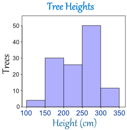
This post is all about histograms.  A histogram is different from a bar graph because the bars touch in a histogram.  This is because the data used in these graphs are numerical.  This means that they have values.  The rest of the things that qualify it as a histogram are the same as a bar graph.  See how in the example histogram below has the bars touching, this is because the numerical values are all very close to each other.


One other important superficiality  about creating a graph is having increments measured in equal chunks.  This way the information is easier to see.  Lastly, every chart needs a title and the axis must be labeled.  This is so the reader of the chart knows what is being graphed.  A histogram is much different then a bar graph because a histogram shows numerical data not categorical data.  This is important with the kind of data collected.

                      Histogram              
(Here is a fun activity for your students to play that goes off of what I have explained about statistics using Histograms.) Histogram activities for a class

Blogroll:
Histograms
How to create a Histogram
Basics of Histograms 
Comparing Histograms
Logging Histograms


Tags:
Histograms Revisited
Games about Histograms
Videos on how to make Histogram
Interactive Histogram activity
Post It teacher activities for Histograms

Tuesday, April 28, 2015

Bar Graphs

In this post I will be talking about bar graphs.  I know we briefly covered this topic with the M&M activity, but we will revisit it in much more detail.  First there are many items that make bar graphs different then other statistic graphs.  The most picky of all is that the bars in a bar graph cannot touch each other.  This is because the data charted is categorical and cannot relate to the surrounding data.
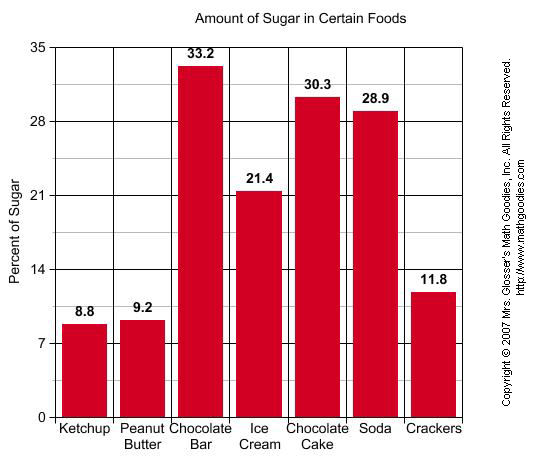
Here are some examples of bar graphs to give a visual of what they can look like.
                             
Notice the bar graphs above show a title, labels, and a consistent way of measuring the data.  The main difference between bar graphs and histograms is that the bars do not touch because of the nature of the data collected.  In my opinion I think a bar graph is easier to read then a pictograph.
Bar graphs are best to use when the mean and median cannot be found due to the data collected.  Lastly, I wanted to point out that a bar graph can be transformed into a pie chart.  Just by cutting the bars out, taping them, and tracing the circle with values for each.
                              
                    Image result for rainbow bar graphs            Image result for rainbow bar graphs
(Here is a fun activity for your students to play that goes off of what I have explained about statistics using bar graphs.)  Create a graph classic

Blogroll:
Bar Graphs
Pie Chart or Bar Graph
Creating Bar Graphs
Line or Bar Graph
Coolness Graphed

Tags:
Review of Bar graphs
Math goodies 
Create a graph
Bar Graph worksheets
Learn about bar graphs

Tuesday, April 21, 2015

Statistics

Statistics

This week I will be breaking down statistics with the help of graphs.  The graphs help to display relationships between collected data.  For this lesson M & M's are used to illustrate the graphs.  For this experimental probability exercise my class and I received individual bags of M & M's.


First, we were asked to make a guess on how many of a specific color we thought we would have in our bag.  Then the same thing with the least we thought we would have.  After that we opened the bag and arranged them into their colors on a graph, like the one you see above.  The picture shows my results from this exercise on a real graph
We then compared our sample to our neighbors and then with the whole class.  A lot of us were very wrong about our predictions about what color would be the most popular or the least popular.  After that we shaded in our graphs to make them pictographs
Next came the Dot Graphs, which gave more of a visual as to what was the most or least present color of M & M.  

\
We totaled all the colors together by taking the number of the "X's" and multiplying it by the number on the number line.  In this exercise we had a total of 378 M & M's.  With the most being Orange and the least being Brown.  I was very off, because in the beginning I predicted there would be the most Red and the least Orange.  

Lastly, we composed another pictograph along with a bar graph.  The difference with the pictograph then the first one is that this graph has one circle representing ten M & M's instead of the one to one ratio before.  Also both of these graphs display the amount of M & M's the whole class had altogether for each color, before it only showed my sample.  I think they both do a fine job of representing how many of each color were in each sample because they look the same.  Although, personally, I think the pictograph was easier to build.   


(Here is a fun activity for your students to play that goes off of what I have explained about statistics using graphs.)  http://www.onlinemathlearning.com/statistics-games.html

Blogroll:


Tags:

Monday, April 13, 2015

Probability: A Breakdown of Mathematics for Elementary School Teachers

Probability   

Image result for probability gamesThis first post is all about probability.  This skill took me a while to grasp and I will do my best to explain the process.  I think the best approach for starting out a new area or chapter in math is to introduce a manipulative.  In an example problem a baggie of rainbow goldfish are distributed to the students.  They are told to count how many crackers they have all together, then to count out the green ones.  The green ones are considered the "sick" group in this experiment.  The other colors are "healthy fish".  The student is then asked to write how many sick fish there are over the number of total fish there are.  This gives you a fraction of how many sick fish there are out of the total.  


Image result for probability definition

The same can be done with the healthy.  Now the next step is to see what the application looks like when given more information.  Further in the problem it states that the park ranger estimates there are a total of 300 fish in the pond.  It is up to us to find the total number of healthy and sick now compared to this ratio.  So first you would multiply your ratio so the denominator is 300 or slightly more if necessary with the "sick" ratio of fish.  Next is to do the same with the "healthy" ones.  (Hint: The two ratios should add up to equal one.)  
Image result for goldfish crackers rainbow                                 Image result for goldfish crackers

(Here is a fun activity for your students to play that goes off of what I have explained about probabilities.)
Tags: